Customer account UX
1st Central are a U.K based insurance company providing car and home insurance for around 1.4 million people.
I was hired to work with the digital team to research, design and deliver a new user experience that would enable customers to manage their insurance products online.
My engagement also involved helping to improve ways of working in the team, elevating the level of UX maturity in the org and contributing to a shared, global design system.
Project type
Website
Industry
Insurance
Role
Lead UX
Date
2025 - 2026
The engagement kicked off with workshops with senior stakeholders to review the existing customer journey so I could understand challenges and opportunities.
I also conducted remote user testing and task analysis with customers, which gave me a good idea of where the friction points were and where customers struggled the most.
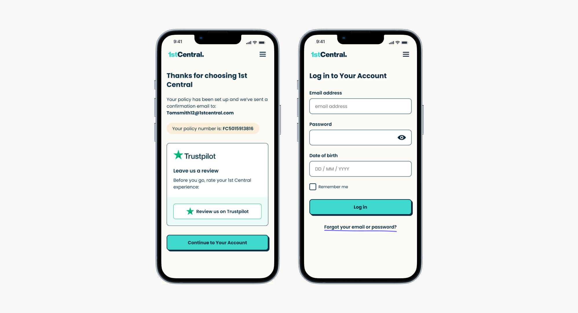
The account setup and login screens were redesigned to reduce the number of steps between purchasing a policy and a customer accessing their account for the first time.
Visual clutter was reduced with only the most important actions left in the journey, like creating a password and asking for a Trustpilot review post purchase.
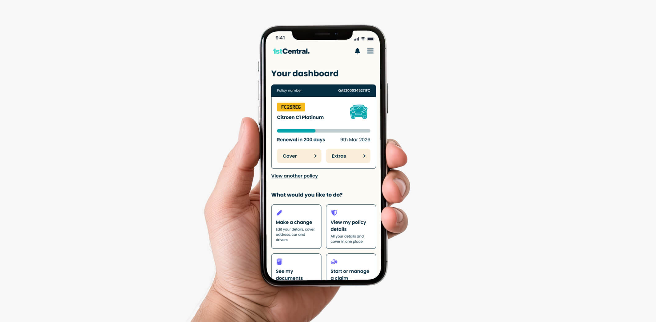
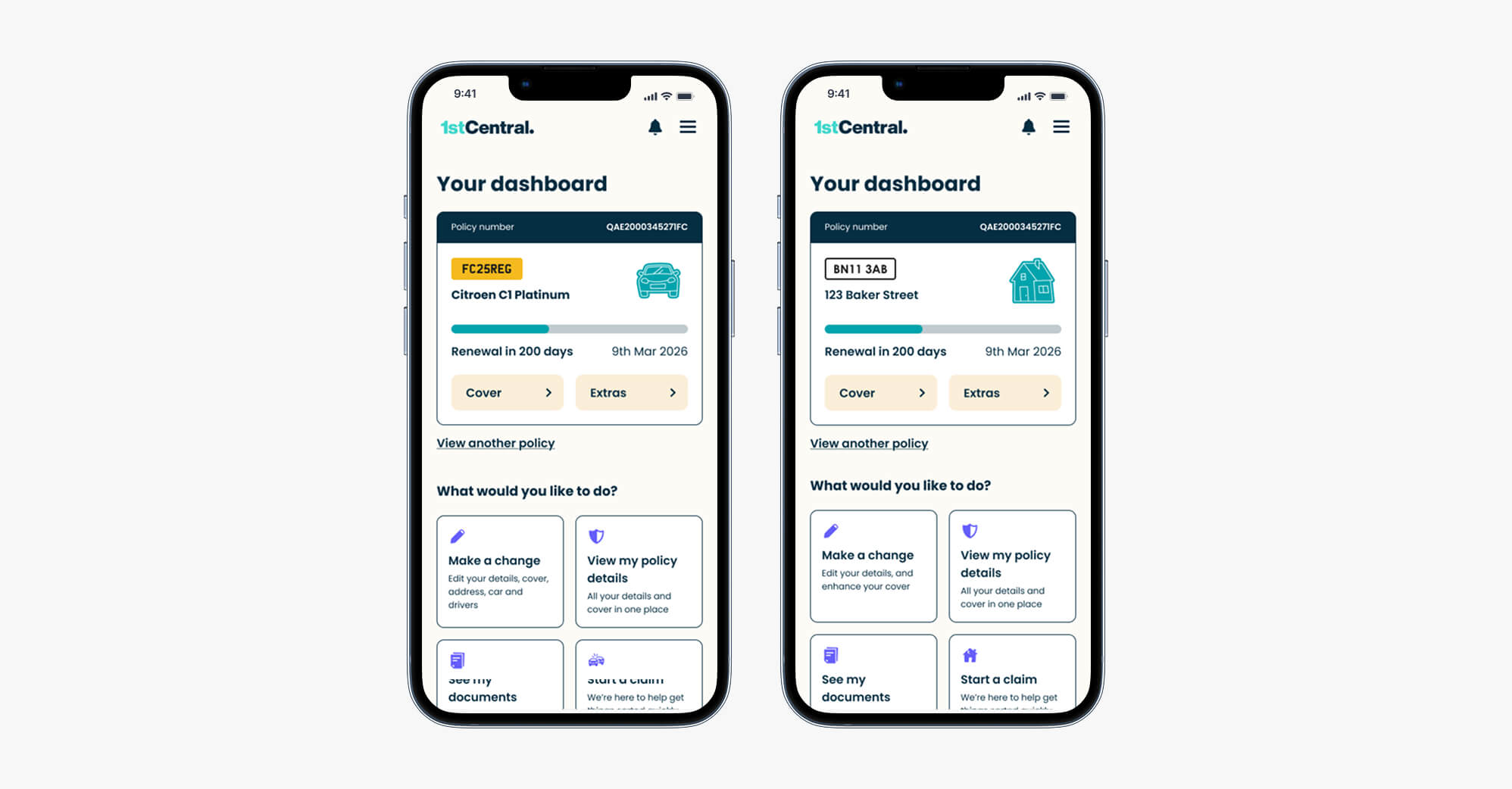
The customer's Dashboard was designed around important tasks that a customer would be likely to want to complete, depending on where they are in their policy cycle.
For example, post purchase, an important task would be accessing policy documents, but closer to policy expiration, getting a renewal quote would take priority as an action.
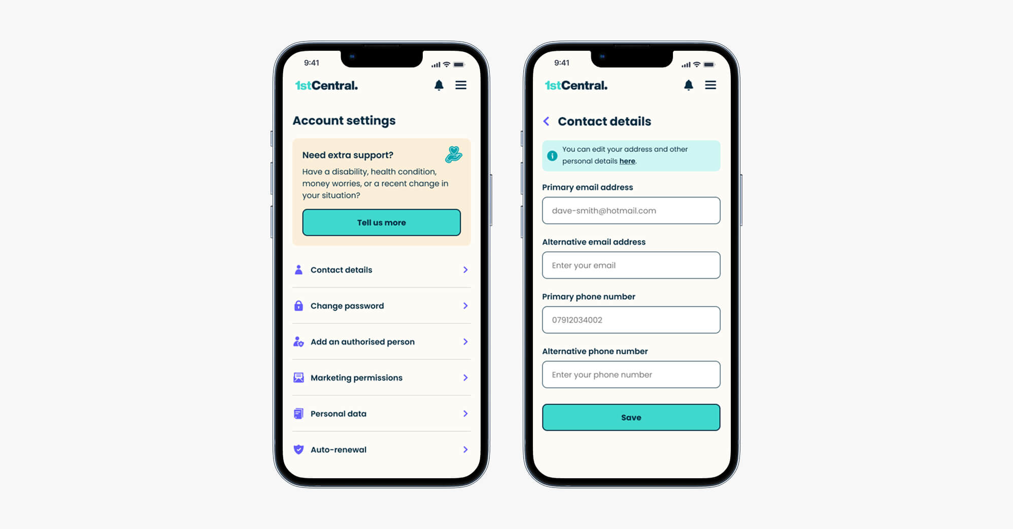
The settings screen and it’s respective journeys were simplified. It was also redesigned to reduce clicks and place more emphasis on vulnerable customers.
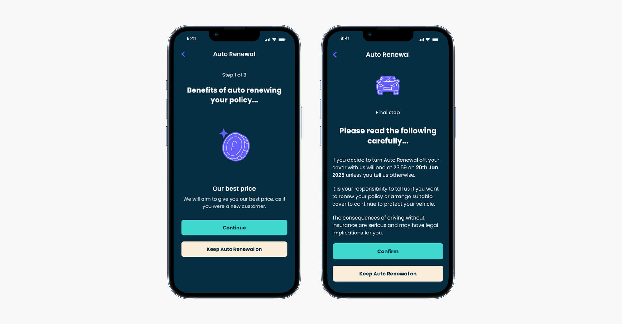
Where appropriate, I also introduced positive friction to get the customer to slow down, pause and think before doing things like turning off auto renewal.
Customers very often turn off auto-renewal because of concerns around price and not wanting a policy to renew without their cosent.
I designed a flow that re-iterated the benefits of auto-renewal to customers and warned them of important considerations, before allowing them to opt out.
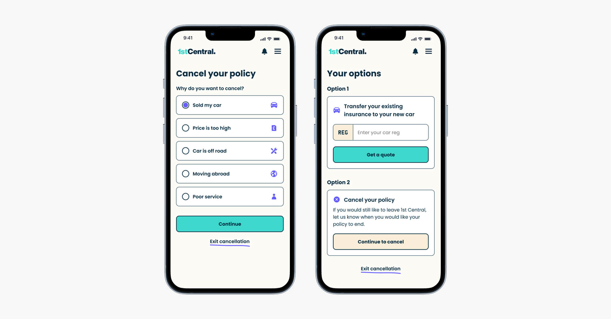
The current cancellation journey gave customers a number of options to choose from as reasons to cancel their policy, some of which customers found confusing.
The new design focused on a reduced set of options and also introduced alternative actions a customer could take to save money, rather than cancelling.
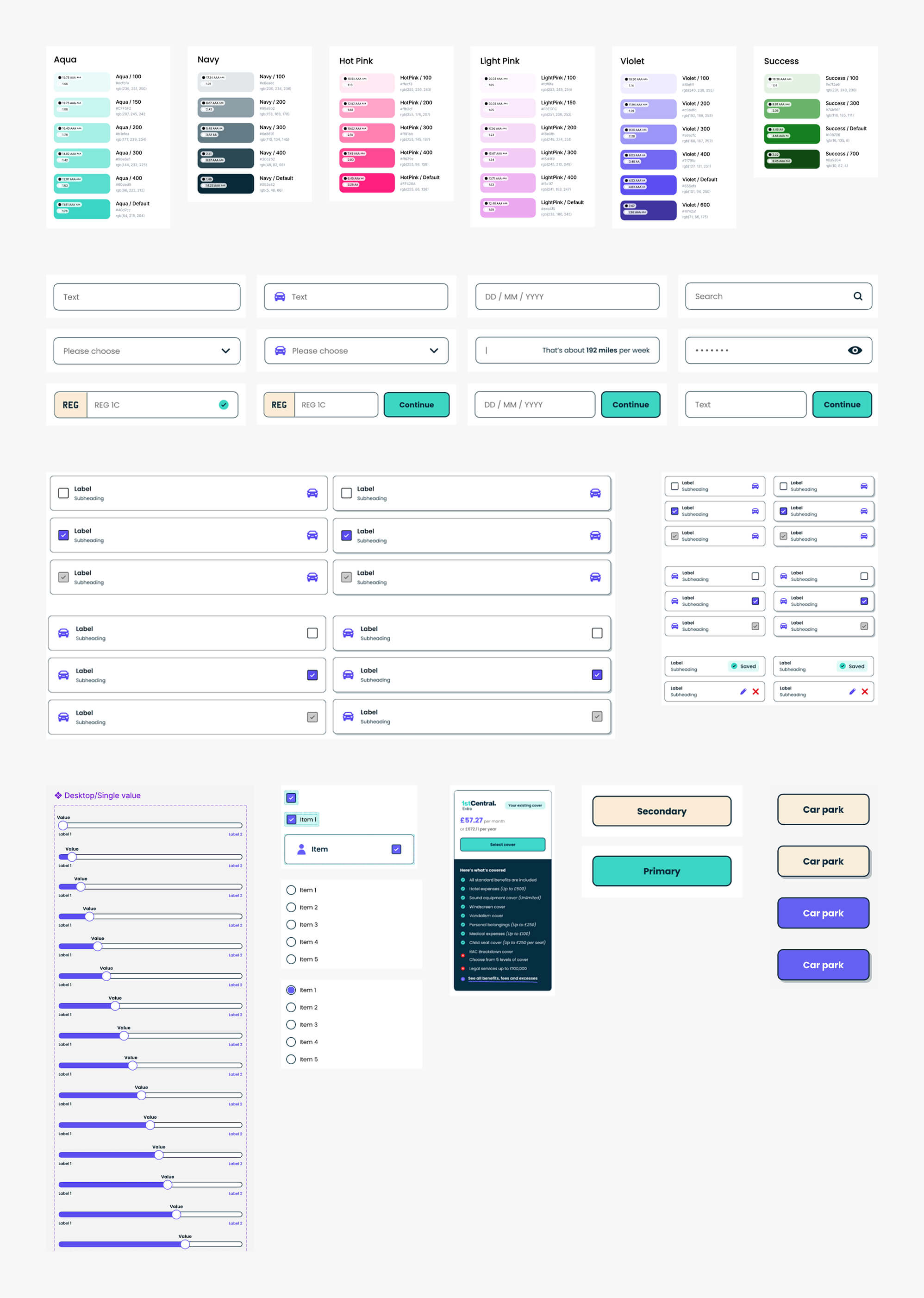
The team was already using a design system to build layouts in a way that was quick, efficient and highly scalable.
During my time working with the team, I contributed to the design system with regular updates, as well as running periodic workshops and reviews with the team.
With each subsequent iteration, we tracked customer metrics with Hotjar and observed an overall NPS quality score increase from 6 to 10.
Customer support tickets decreased by around 26% after the new search journey was completed as users were able to find information more easily.
The organisation observed a sales increase and subsequent revenue increase of around 34% after the new search journey was released.
Working with the team at 1st Central was a really interesting and unique experience. In 12 months we were able to go from research to an updated customer account proposition that is currently being released to customers.
The UX team was small and not without it's challenges, but the team's size also allowed for close collaboration and efficient problem solving within the team, without the need for rigid processes or optimisation.